Derrick Burt's GIS Portfolio
A collection of GIS analyses and maps.
Spatial and Temporal Analysis of Twitter Activity during Hurricane Dorian
Purpose
The purpose of this exercise is to analyze the geographic and temporal distribution of Tweets in the Eastern United States during Hurricane Dorian. In the process of this, we will cover a number off things. First, we will practice scraping twitter data in R using rtweet, cleaning it, and visualizing its temporal trends and performing sentiment analysis. Then, we will send the data to a PostGIS database to join it to county level data and count the level of tweets by county. Then, we will visualize the data with a heatmap of raw tweets and a choropleth of the NDTI (Normalized Tweet Difference Index). Finally, we will use GeoDa to perform a spatial hotspot analysis. Additionally, one of the motivating factors behind this lab was to see if there was a rise in Dorian-related tweets in Alabama after the “sharpie-gate” incident.
Software
The following softwares were used to complete this exercise:
Data
Some of the relevant data for this project will be acquired (with explanation) while the scripts are run. Other data, specifically the actualy twitter content, requires a Twitter API (developer account) to use.
You can download the status ID’s for the tweets analyzed in this exercise here:
Twitter Content Analysis in R
The first portion of this analysis consists of scraping twitter data into R and performing some analyses of the twitter content. You can download the entire R script but I will walk through some of the code as well.
Once you have installed the necesarry packages and loaded them into you library, you can load your API information into R and start scraping twitter data. This requires an API and you can only scrape tweets from the past week.
Code:
#set up twitter API information // #replace app, consumer_key, and consumer_secret data with your own developer acct info
#this should launch a web browser and ask you to log in to twitter
twitter_token <- create_token(
  app = "name",
  consumer_key = "key",
  consumer_secret = "secret",
  access_token = "token",
  access_secret = "secret"
)

#get tweets for hurricane Dorian, searched on September 11, 2019
dorian <- search_tweets("dorian OR hurricane OR sharpiegate",
                        n=200000,
                        include_rts=FALSE,
                        token=twitter_token,
                        geocode="32,-78,1000mi",
                        retryonratelimit=TRUE)
Once you have saved the data into your environment, you can begin analyzing and visualizing the twitter content. Here, we will clean the tweets to only include plain text, unnest them (make rows out of individual words instead of rows of whole tweets), remove the stopwords, and visualize the most used words related to the hurricane.
Code:
dorian$text <- plain_tweets(dorian$text)

dorianText <- select(dorian,text)
dorianWords <- unnest_tokens(dorianText, word, text)

# how many words do you have including the stop words?
count(dorianWords)

#create list of stop words (useless words) and add "t.co" twitter links to the list
data("stop_words")
stop_words <- stop_words %>% add_row(word="t.co",lexicon = "SMART")

dorianWords <- dorianWords %>%
  anti_join(stop_words)

# how many words after removing the stop words?
count(dorianWords)

orianWords %>%
  count(word, sort = TRUE) %>%
  top_n(15) %>%
  mutate(word = reorder(word, n)) %>%
  ggplot(aes(x = word, y = n),
         fill = "darkslategray4") +
  geom_col() +
  xlab(NULL) +
  coord_flip() +
  labs(x = "Count",
       y = "Unique words",
       title = "Count of 15 Most Popular Words in Dorian Tweets") +
  theme(plot.title = element_text(hjust = 0.5),
        axis.text.y = element_text(size = 1)) +
  theme_bw()

The next visualization will pair words in a word cloud that have been used in over 30 tweets together
Code:
#create word pairs
dorianWordPairs <- dorianWords %>% select(word) %>%
  mutate(word = removeWords(word, stop_words$word)) %>%
  unnest_tokens(paired_words, word, token = "ngrams", n = 2)

dorianWordPairs <- separate(dorianWordPairs, paired_words, c("word1", "word2"),sep=" ")
dorianWordPairs <- dorianWordPairs %>% count(word1, word2, sort=TRUE)

#graph a word cloud with space indicating association. you may change the filter to filter more or less than pairs with 10 instances
dorianWordPairs %>%
  filter(n >= 30) %>%
  graph_from_data_frame() %>%
  ggraph(layout = "fr") +
  geom_node_point(color = "darkslategray4", size = 3) +
  geom_node_text(aes(label = name), vjust = 1.8, size = 3) +
  labs(title = "Word Network: Tweets Hurricane Dorian",
       subtitle = "September 2019 - Text mining twitter data ",
       x = "", y = "") +
  theme_void()

Spatial Analysis in Postgis
From R, you can connect to your PostGIS database and upload the twitter data. You can also get a census API and, using the rcensus package, upload that data into R and then send it into a PostGIS database.
Code:
#Connectign to Postgres
#Create a con database connection with the dbConnect function.
#Change the database name, user, and password to your own!
con <- dbConnect(RPostgres::Postgres(),
                 dbname='yourname',
                 host='yourhost',
                 user='youruser',
                 password='yourpassword*')

#list the database tables, to check if the database is working
dbListTables(con)

#create a simple table for uploading
dorain <- select(dorain,c("user_id","status_id","text","lat","lng"),starts_with("place"))

#write data to the database
#replace new_table_name with your new table name
#replace dhshh with the data frame you want to upload to the database
dbWriteTable(con,'dorain',dorian, overwrite=TRUE)
dbWriteTable(con,'november',november, overwrite=TRUE)

#SQL to add geometry column of type point and crs NAD 1983:
#SELECT AddGeometryColumn ('public','winter','geom',4269,'POINT',2, false);
#SQL to calculate geometry: update winter set geom = st_transform(st_makepoint(lng,lat),4326,4269);

#get a Census API here: https://api.census.gov/data/key_signup.html
#replace the key text 'yourkey' with your own key!
Counties <- get_estimates("county",
                          product="population",
                          output="wide",
                          geometry=TRUE,
                          keep_geo_vars=TRUE,
                          key="yourkey")

#make all lower-case names for this table
counties <- lownames(Counties)
dbWriteTable(con,'counties',counties, overwrite=TRUE)
#SQL to update geometry column for the new table: select populate_geometry_columns('westcounties'::regclass);

#disconnect from the database
dbDisconnect(con)
With the twitter data and county-level data in R, you can begin. Here is the full SQL script I wrote to work clean, join, and perform the calculations on this data.
Code for Cleaning and Reprojecting to USA Contiguous Lambert Conformal Conic:
/* Add a projected coordinate system to your database (will need it for twitter data) */
INSERT into spatial_ref_sys (srid, auth_name, auth_srid, proj4text, srtext) values ( 9102004, 'esri', 102004, '+proj=lcc +lat_1=33 +lat_2=45 +lat_0=39 +lon_0=-96 +x_0=0 +y_0=0 +ellps=GRS80 +datum=NAD83 +units=m +no_defs ', 'PROJCS["USA_Contiguous_Lambert_Conformal_Conic",GEOGCS["GCS_North_American_1983",DATUM["North_American_Datum_1983",SPHEROID["GRS_1980",6378137,298.257222101]],PRIMEM["Greenwich",0],UNIT["Degree",0.017453292519943295]],PROJECTION["Lambert_Conformal_Conic_2SP"],PARAMETER["False_Easting",0],PARAMETER["False_Northing",0],PARAMETER["Central_Meridian",-96],PARAMETER["Standard_Parallel_1",33],PARAMETER["Standard_Parallel_2",45],PARAMETER["Latitude_Of_Origin",39],UNIT["Meter",1],AUTHORITY["EPSG","102004"]]');

/* Add geometry column to twitter data */
ALTER TABLE dorian ADD COLUMN geom geometry;
ALTER TABLE november ADD COLUMN geom geometry;

/* Create points for twitter data, reproject, and populate geometry columns */
UPDATE dorian
SET geom = ST_TRANSFORM( ST_SETSRID( ST_MAKEPOINT(lng, lat), 4326), 102004);
SELECT populate_geometry_columns('dorian'::regclass);

UPDATE november
SET geom = ST_TRANSFORM( ST_SETSRID( ST_MAKEPOINT(lng, lat), 4326), 102004);
SELECT populate_geometry_columns('november'::regclass);

/* Counties should be imported from R with the correct geometry type but no srid */
/* Set SRID for the counties data */
/* select srid -- if set then look for select populate geom columns (if not then have to do to query to set them */
ALTER TABLE counties
ALTER COLUMN geometry TYPE geometry(MultiPolygon,102004)
USING ST_SetSRID(geometry,102004);

/* update geometry of counties */
/* for some reason -- the Query above projects it into the map in WGS 84 (visually) even though it claims it is 102004, the additional query below seems to clear this error */
UPDATE counties
SET geometry = ST_TRANSFORM( ST_SETSRID( geometry, 4326), 102004);

/* Add a primary key to counties */
ALTER TABLE counties ADD PRIMARY KEY (geoid);

/* Get rid of counties outside of area of interest (east coast) */
DELETE FROM counties
WHERE statefp NOT IN ('54',	'51',	'50',	'47',	'45',	'44',	'42',	'39',	'37',	'36',	'34',	'33',	'29',	'28',	'25',	'24',	'23',	'22',	'21',	'18',	'17',	'13',	'12',	'11',	'10',	'09',	'05',	'01');
After the twitter data has been cleaned and properly projected, I joined the county ID to a newly created twitter ID on an intersect. With the twitter data joined to the counties, I calculated the tweet rate per 1000 people, the NDTI (normalize tweet difference index - Professor Holler’s rebranding of NDVI), and created centroids to make a kernel density map.
Code:
/* Count number of each type of tweet by county */
/* add geoid column to tweet tables to count by */
ALTER TABLE dorian ADD COLUMN geoid varchar(5);
ALTER TABLE november ADD COLUMN geoid varchar(5);

/* match respective tweet geoid column to county column where they intersect */
UPDATE dorian
SET geoid = counties.geoid
FROM counties
WHERE ST_INTERSECTS(dorian.geom, counties.geometry);

UPDATE november
SET geoid = counties.geoid
FROM counties
WHERE ST_INTERSECTS(november.geom, counties.geometry);

/* Count unique values to find column to count number of tweets by  */
SELECT DISTINCT user_id, status_id
FROM dorian;

/* Create tables with tweet counties grouped by county */
CREATE TABLE dorian_ct AS
SELECT COUNT(user_id), geoid
FROM dorian
GROUP BY geoid;

CREATE TABLE november_ct AS
SELECT COUNT(user_id), geoid
FROM november
GROUP BY geoid;

/* Add columns to for respective tweet counts, set count column to zero so nulls are counted as zeros, and then populate with counts from aggregated twitter counts */
ALTER TABLE counties ADD COLUMN dorian_ct INTEGER;
UPDATE counties
SET dorian_ct = 0;
UPDATE counties
SET dorian_ct = dorian_ct.count
FROM dorian_ct
WHERE dorian_ct.geoid = counties.geoid;

ALTER TABLE counties ADD COLUMN nov_ct INTEGER;
UPDATE counties
SET nov_ct = 0;
UPDATE counties
SET nov_ct = november_ct.count
FROM november_ct
WHERE november_ct.geoid = counties.geoid;

/* Add column to calculate tweet rate and calculate rate per 10000 people */
ALTER TABLE counties ADD COLUMN dorian_rt REAL;
UPDATE counties
SET dorian_rt = (dorian_ct/pop) * 10000;

ALTER TABLE counties ADD COLUMN nov_rt REAL;
UPDATE counties
SET nov_rt = (nov_ct/pop) * 10000;

/* Add column to calculate NDTI */
ALTER TABLE counties ADD COLUMN ndti REAL;
UPDATE counties
SET ndti = (1.0 * dorian_ct - nov_ct)/(1.0 * dorian_ct + nov_ct)
WHERE (dorian_ct + nov_ct) > 0;

/* Set NDTI Nulls = 0 */
UPDATE counties
SET ndti = 0
WHERE ndti = null;

/* Centroids for heat map */
CREATE TABLE counties_pts AS
SELECT*, ST_CENTROID(geometry)
FROM counties
Initial Tweet Visualization
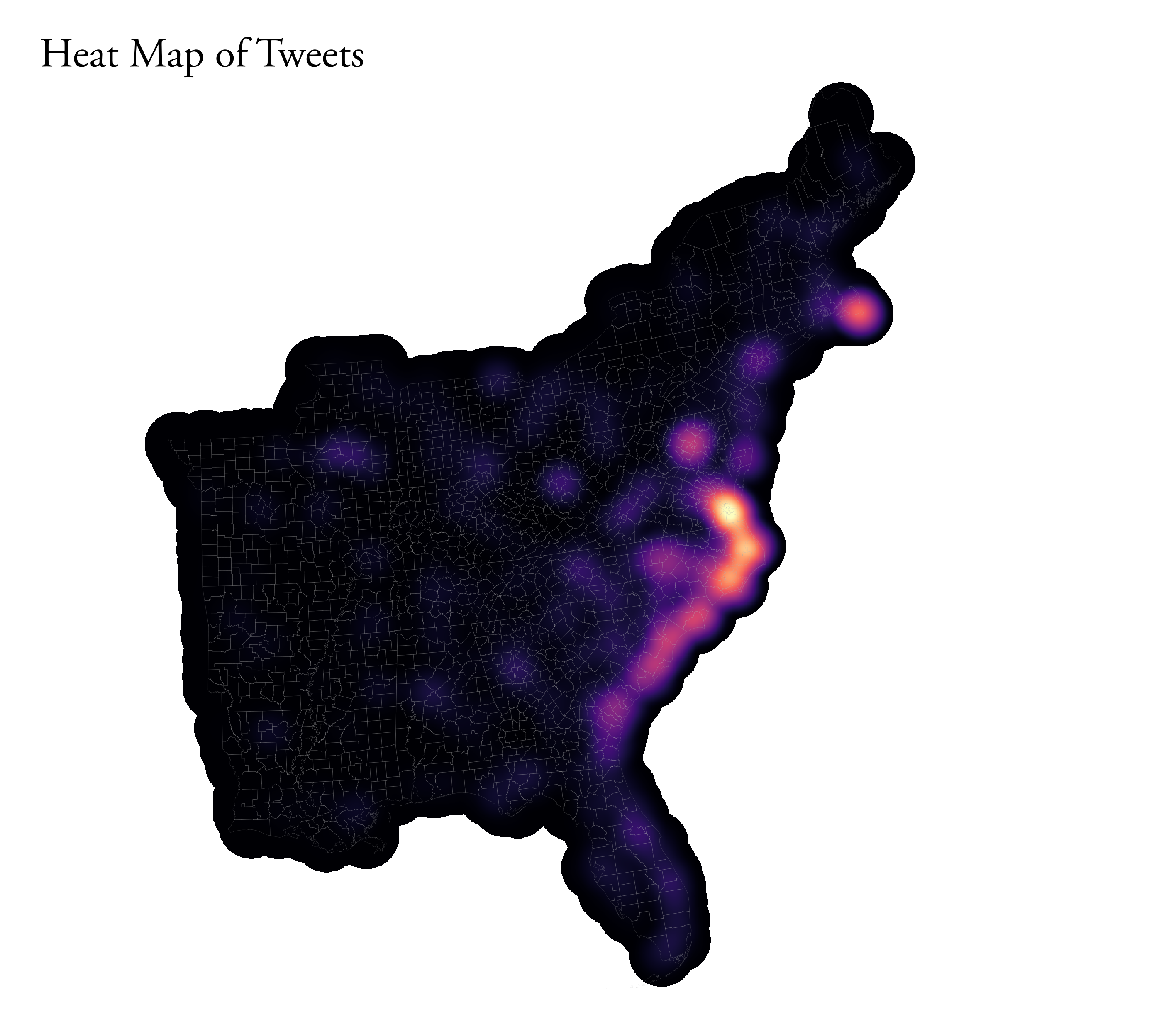
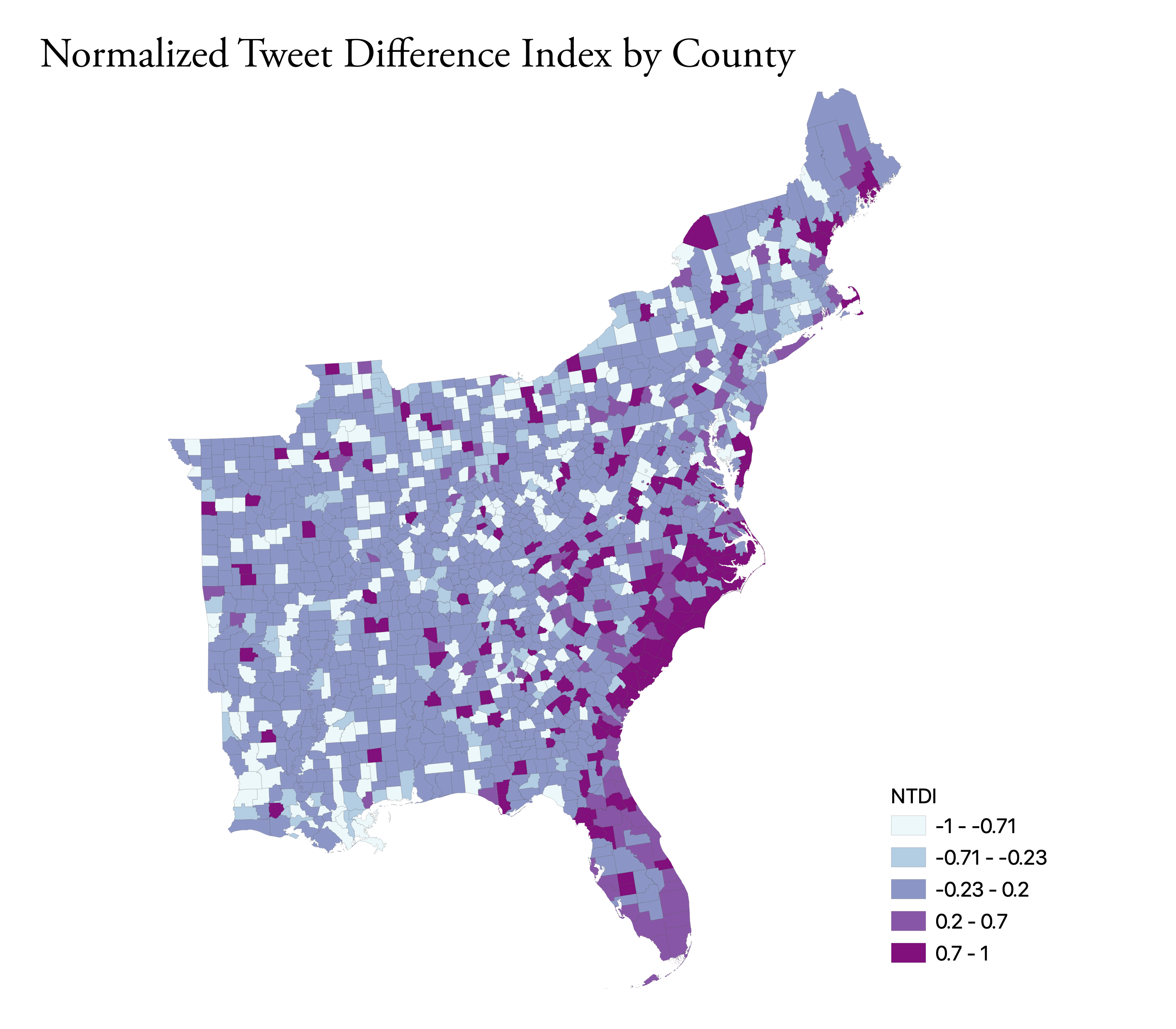
Using the data from the above queries, I produced two maps in QGIS to visualize the twitter data.
The first, below is a kernel density map, a heat map that shows the most concentrated locations of tweets per 10,000 people. For the parameters, I set the radius to 100km to emphasize counties with higher tweets, used 500 meters pixels (for smoother, go smaller – it just may take longer to make), and set the “Weight from field” to the dorian tweet rate (per 10,000). The map shows the largest clustering of tweets along the coasts of North Carolina, South Carolina, and Virgina as well as a smaller cluster on the Coast of Southern Massachussets around Cape Cod. These are areas that were most affected by Dorian.
The second visualizes the NDTI, which is basically just a normalization of the tweets about Dorian compared to the baseline activity. The calculation: (tweets about Dorian – baseline November tweets)/(tweets about Dorian + baseline November tweets). The map shows higher than normal twitter activity along the Southern coast as well as parts Florida. Similar to the heat map, we are seeing an increase in twitter activity in the locations hit hardest by Dorian.
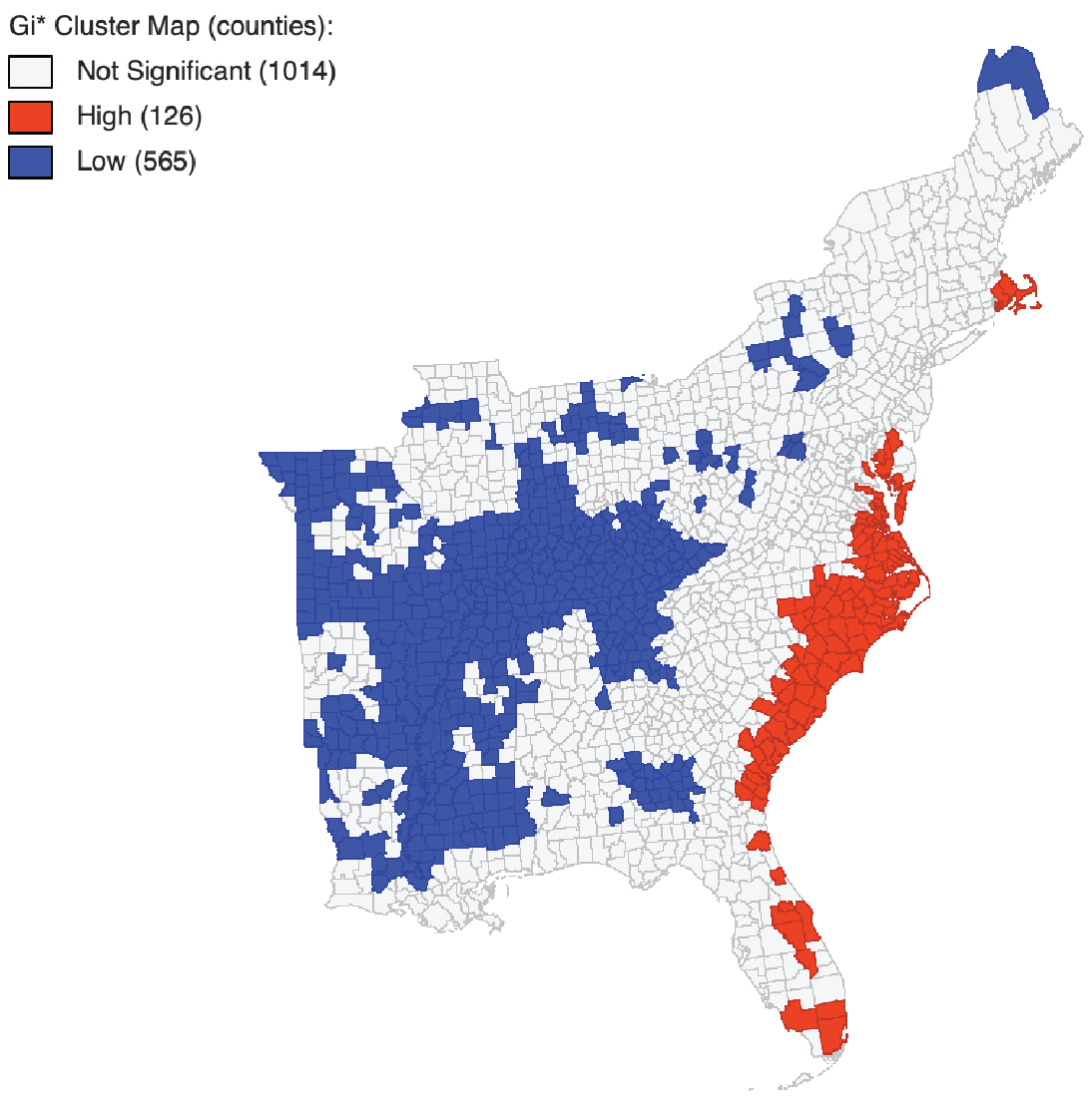
Clustering and Hotspot Visualization in GeoDa
Using Geoda, an open source platform for spatial data analysis, I calculated the Gi* clustering for the counties to detect hotspot. What this statistic essentially does is calculate stastically significant coldspots (counties with low tweet rates that are surrounded by counties with low tweet rates) and statistically significant hotspots (counties with high tweet rates that are surrounded by counties with high tweet rates).
To make these maps, I used the Database selection (using all the necesarry criteria for my database) to import the counties table from my PostGIS database into GeoDA. Then, I selected Tools > Weights Manager, choosing my dorian tweet rate statistic as my ID and using Distance Weight as my default parameter. I then select Space > Local G*, choosing the tweet rate variable as my weight, including a significance map, a cluster map, and row-standardized weights.
The significance map below shows the counties that had statistically significant clustering (regardless of whether they were hot or cold) and their respective significance.

The cluster map below visualize the hotspots and the coldspots at a significance level of p = 0.05. Several counties along the southern coast (especially Virginia, North Carolina, and South Carolina) had many counties considered significant hotpsots. There were also some counties in eastern Florida and on the coast of Massachussets with significant clustering. Several counties in the midwest were statistically significant lowspots.
Discussion
This analysis shows us that there does seem to be a correlation between twitter activity and areas affected by natural disasters (Wang et al. 2016). Even though Donald Trump may have grabbed national attention by drawing a sharpie-line around Alabama, it seems that there was no surge in twitter activity in Alabama. Instead, we find that most significant clustering of twitter activity related to the storm was in areas that were physically impacted by the storm. This is useful information because when the power goes out or other lines of communication are interrupted, EMTs, firefighters, and other responder may actually be able to reliably use these tweets to recognize areas that are being impacted by the storm (Wang et al. 2016).
Resources
Wang, Z., Ye, X., & Tsou, M. H. (2016). Spatial, temporal, and content analysis of Twitter for wildfire hazards. Natural Hazards, 83(1), 523-540.